


1
2
3
4
5
6
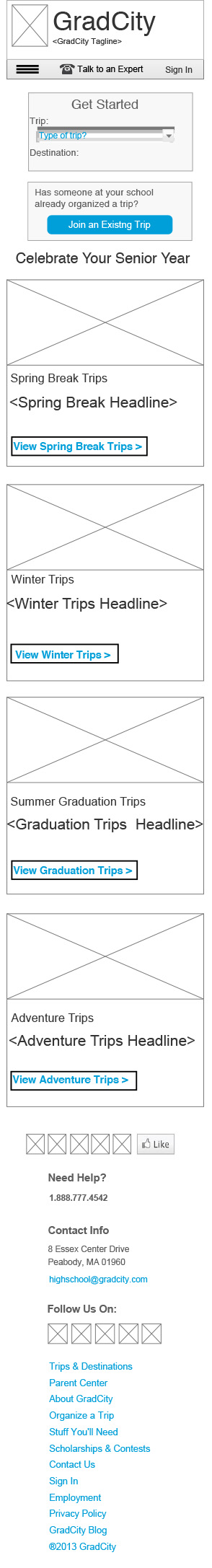
In September of 2013 I took a contract job at OHO Interactive. This digital agency does a lot of work with higher educational institutions, and non-profits. This travel planning company I got to work on was a really great opportunity for me. I was given the wireframes in desktop (x960) format. It was my job to think about how to size them responsively for tablet (x768) and for mobile (x320). I used Axure to do my responsive designs because you can easily set up your grids and toggle back and forth. You can easily turn your wires into a prototype as well, to show the client the experience of the website.
Homepage: Tablet
Homepage: Mobile
Landing Page: Tablet
Landing Page: Mobile